10 Errores de Diseño Web Que Te Están Haciendo Perder Clientes
Descubre los errores de diseño web más comunes que ahuyentan visitantes y aprende cómo corregirlos para aumentar conversiones y retención.

Tu sitio web suele ser la primera interacción que un cliente potencial tiene con tu marca. Si esa primera impresión es mala, se van—y rara vez regresan. Los estudios muestran que el 94% de las primeras impresiones están relacionadas con el diseño, y el 88% de los consumidores en línea son menos propensos a regresar después de una mala experiencia.
¿La parte frustrante? Muchos de estos errores de diseño son fáciles de corregir una vez que sabes qué buscar. Aquí están los 10 errores de diseño web más comunes que silenciosamente están alejando clientes de tu negocio.
1. Tiempos de Carga Lentos
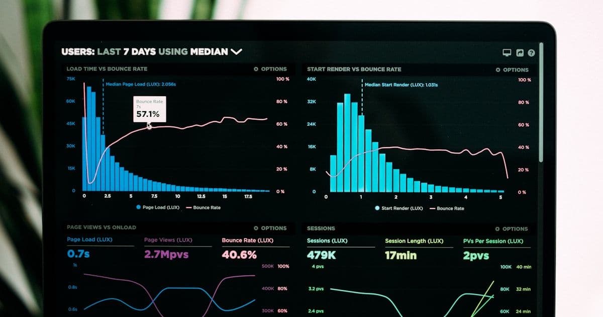
La velocidad no es opcional—es un factor de ranking y de conversión. La investigación de Google muestra que el 53% de los visitantes móviles abandonan sitios que tardan más de 3 segundos en cargar. Cada segundo adicional de tiempo de carga reduce las conversiones hasta un 20%.
Los culpables comunes incluyen imágenes sin optimizar, JavaScript que bloquea el renderizado, scripts excesivos de terceros y falta de caché del navegador. Herramientas como Google PageSpeed Insights y Lighthouse pueden identificar exactamente qué está ralentizando tu sitio.
2. Mala Experiencia Móvil
Más del 60% del tráfico web proviene de dispositivos móviles, pero muchos sitios web aún tratan lo móvil como algo secundario. Objetivos de toque diminutos, desplazamiento horizontal, texto ilegible y popups que cubren toda la pantalla son asesinos de la experiencia móvil.
Con la indexación mobile-first de Google, tu experiencia móvil impacta directamente tus rankings de búsqueda. Prueba tu sitio en dispositivos reales—no solo en herramientas de desarrollo del navegador—para detectar problemas que tus usuarios realmente enfrentan.
3. Navegación Confusa
Si los visitantes no pueden encontrar lo que buscan en unos segundos, se van. Mega-menús demasiado complejos, etiquetas vagas como 'Soluciones' o 'Recursos', e información de contacto enterrada crean fricción que empuja a los clientes potenciales hacia la competencia.
Mantén tu navegación simple e intuitiva. Usa etiquetas claras y descriptivas. Coloca tus páginas más importantes—servicios, precios, contacto—de manera prominente en el menú principal.
4. Sin Llamada a la Acción Clara
Cada página de tu sitio web debe guiar a los visitantes hacia una acción específica. Sin una llamada a la acción clara y visible, los visitantes navegan sin rumbo y se van sin convertir. El error más común es no tener CTA o tener demasiados CTAs que compiten y abruman al visitante.
Los CTAs efectivos usan lenguaje orientado a la acción, destacan visualmente del contenido circundante y aparecen en puntos de decisión lógicos a lo largo de la página.
5. Diseños Saturados y Abrumadores
Cuando todo en una página demanda atención, nada la obtiene. Diseños saturados con texto excesivo, elementos visuales que compiten y sin espacio en blanco crean sobrecarga cognitiva. Los visitantes se sienten abrumados y se van en lugar de intentar descifrar el caos.
Abraza el espacio en blanco. No es espacio desperdiciado—es espacio para respirar que guía la vista y mejora la comprensión.
6. Diseño Visual Desactualizado
Las tendencias de diseño evolucionan, y un sitio web que lucía moderno hace cinco años ahora puede señalar que tu negocio está atrasado. Un diseño moderno señala confianza y profesionalismo.
7. Señales de Confianza Débiles o Ausentes
Los visitantes necesitan razones para confiar antes de entregar su información de contacto. Sitios web sin testimonios, casos de estudio, insignias de seguridad o logotipos de clientes crean dudas que alejan a los clientes potenciales.
8. Mala Legibilidad del Contenido
Párrafos largos, fuentes pequeñas, bajo contraste y muros de texto sin estructura hacen que el contenido sea difícil de consumir. Usa encabezados claros, párrafos cortos, viñetas y tamaños de fuente adecuados.
9. Formularios y Procesos de Pago Rotos
Nada es más frustrante que llenar un formulario solo para encontrar un error sin explicación clara. Formularios rotos, mensajes de validación confusos y procesos de pago demasiado largos son asesinos de conversiones.
10. Ignorar la Accesibilidad
La accesibilidad web no es solo una consideración legal—es una oportunidad de negocio. Más de mil millones de personas viven con alguna forma de discapacidad. Un sitio web inaccesible excluye clientes potenciales.
Obtén una Auditoría Profesional de Tu Sitio Web
Lima Web Studios se especializa en construir sitios web de alto rendimiento que convierten visitantes en clientes. Nuestro equipo puede auditar tu sitio actual, identificar los problemas de diseño que te están costando negocio e implementar soluciones con resultados medibles.
Contáctanos hoy para una auditoría gratuita de tu sitio web y descubre cuántos ingresos está dejando tu diseño actual sobre la mesa.
Te puede interesar

La Guia Completa de SEO para Empresas B2B
Aprenda a construir una estrategia SEO B2B que genere leads calificados e ingresos. Desde investigacion de palabras clave hasta atribucion de pipeline.
SEO vs PPC para B2B: Que Estrategia Ofrece Mejor ROI?
Compare SEO y PPC para marketing B2B con datos reales de costos, cronogramas de ROI y un marco de estrategia integrada para maximizar la generacion de prospectos.

¿Por Qué Tu Sitio Web No Aparece en Google? (Y Cómo Solucionarlo)
Descubre 10 razones comunes por las que tu sitio web no aparece en Google y obtén un plan de acción paso a paso para solucionarlo.